
I saw an exchange over on Mastodon about a small bit of the State of JS results interface. Paweł noticed a little movement on a table cell label that seemed glitchy. Sacha described it as an issue due to a reveal effect: when a label would be longer than the table cell it was in, hovering it would scroll it so you could read the whole thing, but short labels were also affected. So I inserted myself into the conversation, of course.
With CSS container query units, we can know the size of the cell (100cqi), and with a child element, the size of the full line of text (100%). Well, a pinch of maths should tell us how much text is hidden: 100% - 100cqi. Check out the result below, and keep on reading for the full breakdown.
Result
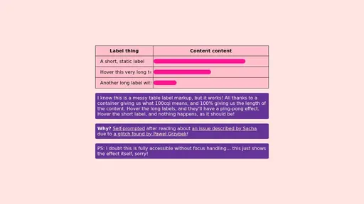
The idea
In this example, we are working with a table, and to make this effect work, I had to ensure the container was set to display: block. Table cells have a bespoke display value of table-cell (shocker!), so to avoid breaking the table layout, the text (span) must be wrapped in a container element (div), which will be inside the cell (td). Maybe there’s a way to remove one layer, but I’m just playing around — optimise at your own leisure!
So, to get all of this right, we need:
<table>
	<!-- For brevity, I am skipping the thead section and the tbody wrapper -->
	<tr>
		<td class="cell">
			<div class="container">
				<span class="text">
					Here is a longer piece of text that will overflow
				</span>
			</div>
		</td>
		<td>I am a regular piece of content that will just take up space in the table like a normal cell</td>
	</tr>
</table>.cell {
inline-size: 20ch; /* Optional, nice to have for this demo */
}
.container {
container-type: inline-size; /* Essential for our trick */
overflow: hidden; /* Prevents text in the next cells */
}
.text {
--offset: calc(100% - 100cqi); /* Returns the overflow length, if any */
display: block; /* Only needed because this element is a <span> */
inline-size: max-content; /* Allows the element grow past the container limit */
text-wrap: nowrap; /* `max-content` actually triggers this already but I like being explicit */
}Animate
The last piece of the puzzle is to animate this on hover (or focus! — sorry I am not diving into the accessibility of tables in this short-ish post, but it’s good to consider how that’d work).
We do not, however, want the shorter labels which do fit in the cell to animate, so we can add a max() to give the offset a minimum value of 0px: --offset: max(0px, 100% - 100cqi) (FYI: a calc wrapper is not required inside math functions like min, max, clamp, etc.). That will make the animation scroll from 0px to 0px for small labels instead of a negative length, and longer labels will compute to a positive length.
.container:hover .text {
    /* Animation names don't need double-dash prefixes but I like doing so for clarity,
    I believe I picked that habit up from Roma Komarov (a.k.a. kizu) */
	animation: --pingpong 4s ease-in-out alternate infinite;
}
@keyframes --pingpong {
    /* In left-to-right contexts, we want the label to go left, so we need a negative number */
	to { translate: calc(var(--offset) * -1); }
}
We can “simplify” our translate by flipping the --offset expression since (A-B) = -1 * (B-A) — and since we’re flipping it, our max() becomes min():
.text {
	--offset: min(0px, 100cqi - 100%); /* Essentially clamps from -Infinity to 0px */
}
@keyframes --pingpong {
	to { translate: var(--offset); }
}
If you find other way around more readable, use that! Shorter code for the sake of saving a handful of bytes is ridiculous — use what makes sense to you.
If you have right-to-left content, then having a calc could be needed to change the direction of the translate because we don’t have anything like transform-mapping: logical (from my 2024 wishlist!). Sad boop.
I’d use a --factor variable that flips from 1 to -1 in RTL, but you could use the flipped math, too:
/* EITHER */
.text:dir(rtl) {
	--factor: -1;
}
@keyframes --pingpong {
	to { translate: calc(var(--offset) * var(--factor, 1)); }
}
/* OR */
.text:dir(rtl) {
	--offset: max(0px, 100% - 100cqi); /* In RTL contexts, move in the other direction */
}
@keyframes --pingpong {
	to { translate: var(--offset); }
}
Faded affordance
One last consideration is affordance. I think a cut-off letter is a pretty clear indicator that something is missing. But what if the cell cuts off right after a word? To account for this, we can use a mask on the container’s inline edges, which is just like scroll shadows. With some padding and a mask matching the padding size, it’s a breeze. You could likely also use scroll-driven animations to progressively mask either side, but I’m keeping it simple for now… Here are some more styles we can use to achieve this:
table {
	--padding: 1rem;
}

th,
td:not(:has(.container)),
.container {
	/* We could just pad all th/td and use a negative margin on the .container but that's hacky */
	padding-block: calc(var(--padding) / 2);
	padding-inline: var(--padding);
}

.container {
	mask: linear-gradient(to right,
		transparent,
		tan var(--padding) calc(100% - var(--padding)),
		/* This is a 2-position color stop, any solid color will do, but `tan` is short — `red` or `deeppink` work too! */
		transparent
	);
}
Now, the edges of the text are faded: a little affordance, just like that!
Cleanup
I added .text { translate: 0; } as well because on a 72 DPI monitor with Firefox, I got a little flicker on hover for text labels that didn’t need the scroll. A flicker was the initial problem, so we definitely don’t want that! My gut tells me it’s a GPU thing, so this addition keeps it static by making it GPU-accelerated at all times.
Alternatives
- Using
animationallows for a continuous ping-pong effect. If we wanted to just scroll to the end and stay there, atransitionwould work (and would smoothly revert when unhovered). - Scroll-driven animations could likely achieve a similar result, but their support across browsers isn’t as wide.
- Using an actual horizontal scrollbar, but that’s not quite as compact.
- Removing the
overflow: hiddenstyle on the container on hover, and adding a background colour to let it overlap the next cell. - Letting the text wrap!
Relative duration?
If you wanted to over-engineer the crap out of it, maybe you could use Jane Ori’s scalar trick to compute a relative animation time based on the distance to “travel”, so you’d have an animation that goes about 30 pixels per second, instead of a static duration? I hit a roadblock though: while 100% - 100cqi makes sense in a translate context, if you’re creating a variable that ultimately is consumed as a animation-duration, that 100% value doesn’t really make sense. This is definitely solvable with scroll-driven animations (again!), but I have rambled enough. Still, if you want to push this further, here’s how far I got before realising it wouldn’t work with the existing setup:
.text {
	--travel: tan(atan2(abs(var(--offset)), 1px)); /* Whether it goes left or right, we just want the difference */
	--pps: 30; /* PPS = pixels per second */
	--duration: calc(var(--travel) / var(--pps) * 1s);

	.container:hover & {
		animation-duration: var(--duration);
	}
}
Final code
You can pull the code from the CodePen but here’s the full CSS from this post:
table {
	--padding: 1rem;
}

th,
td:not(:has(.container)),
.container {
	/* We could just pad all th/td and use a negative margin on the .container but that's hacky */
	padding-block: calc(var(--padding) / 2);
	padding-inline: var(--padding);
}

.cell {
	inline-size: 20ch; /* Optional, nice to have for this demo */
}
.container {
	container-type: inline-size; /* Essential for our trick */
	overflow: hidden; /* Prevents text in the next cells */
}
.text {
	/* Returns the overflow length, if any — essentially clamps from -Infinity to 0px */
	--offset: min(0px, 100cqi - 100%);

	display: block; /* Only needed because this element is a <span> */
	inline-size: max-content; /* Allows the element grow past the container limit */
	text-wrap: nowrap; /* `max-content` actually triggers this already but I like being explicit */

	mask: linear-gradient(to right,
		transparent,
		tan var(--padding) calc(100% - var(--padding)),
		/* This is a 2-position color stop, any solid color will do, but `tan` is short — `red` or `deeppink` work too! */
		transparent
	);
}
.text:dir(rtl) {
	/* In RTL contexts, move in the other direction: 0px to Infinity */
	--offset: max(0px, 100% - 100cqi);
}
.container:hover .text {
    /* Animation names don't need double-dash prefixes but I like doing so for clarity,
    I believe I picked that habit up from Roma Komarov (a.k.a. kizu) */
	animation: --pingpong 4s ease-in-out alternate infinite;
}
@keyframes --pingpong {
	to { translate: var(--offset); }
}


